Kinsight
For my senior project, I created a digital platform for caregivers and care recipients to connect with themselves, each other, and the proper resources for their unique journeys. Kinsight aims to address caregiver burnout and support both parties in their emotional health and relationships.
For the full process with weekly updates, visit my senior project blog.
Tools: Sketch, Invision, Principle, Premiere Pro
Practice gratitude and recognize your feelings and situation with daily check-ins.
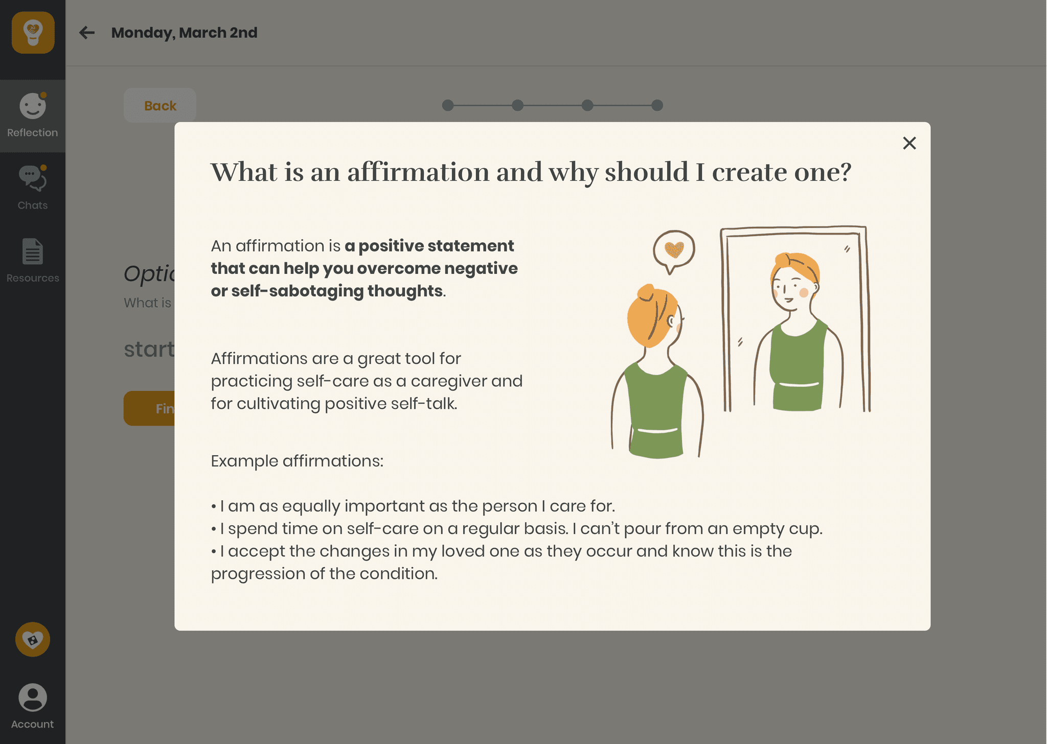
Remind and honour yourself for the effort and love that you have put into caregiving by creating affirmations.
Recognize and articulate your thoughts and feelings by creating time capsules.
View the progress of your journey by setting and receiving look back emails for your capsule. Share these cherished memories with your loved ones.
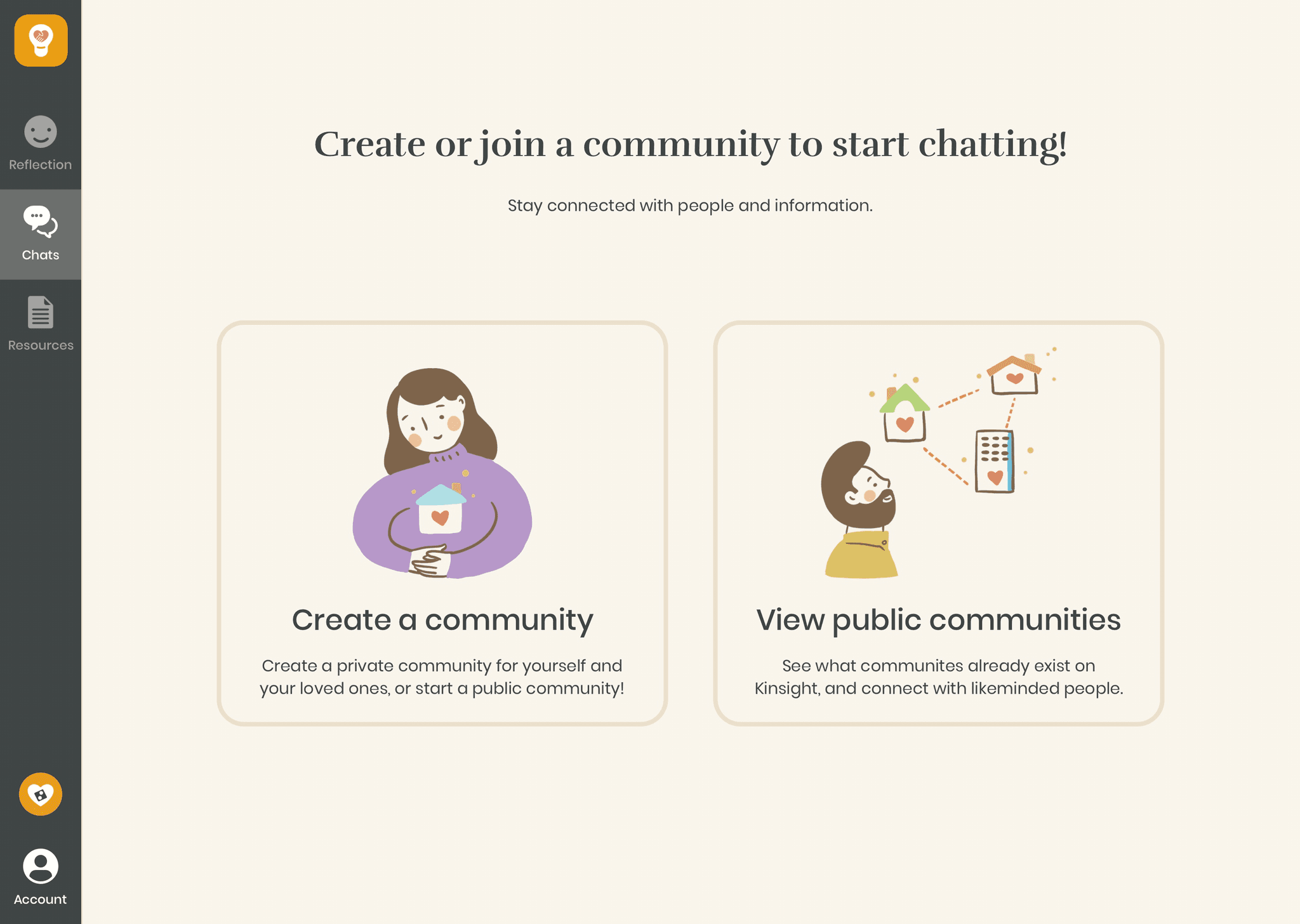
Stay connected and updated with each other by joining or creating a community.
Ensure the right people get the relevant information using topic chats.
Get curated resources relevant to your situation with a quick onboarding process.
Know where your resources are coming from, and save them for later.
The World of Caregiving
"Caregiving is like being in the midst of a tornado. It was an honour to care for my mom, but I would've died without my support group."
Caring for a loved one can be one of the most precious experiences in our lives; however, it is often an extremely demanding role we can find ourselves in. The above quote from one of my research participants perfectly exemplifies this.
There are currently over 40 million unpaid family caregivers in America. The role of a caregiver is a major and taxing responsibility for many, and is often overlooked in our society. The average caregiver spends at least 20 hours a week providing care, while balancing other aspects of their lives (work, family, etc). The demand for care will only continue to increase as our population ages.
It's easy to become so focused on looking after others that we forget to care for ourselves. Many caregivers suffer from caregiver burnout, which occurs when they are physically, emotionally, and mentally overwhelmed and exhausted by their duties. This can become so severe that they lose both the will and ability to not only properly care for their loved ones, but also themselves.
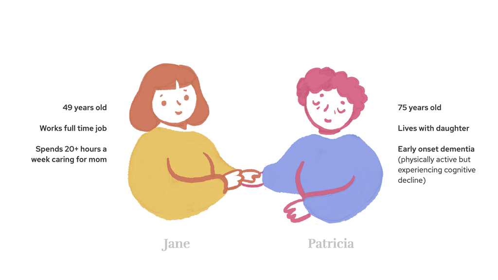
Jane and Patricia are an example of a common caregiver and care recipient relationship.
What do caregivers and care recipients struggle with?
In my first semester of senior year, I was focused on senior care for my senior project. From October 2019 until shelter-in-place in March 2020, I volunteered weekly at a senior center. I also visited 3 different senior care homes and spoke with professionals in the space. I sent out surveys and conducted interviews. I wanted to foster close relationships and step into the world of elderly care and caregiving, instead of watch from outside.
In January, I pivoted to focusing on caregiving. I had been speaking to many caregivers and discovered the tremendous potential and need to create something valuable and meaningful in this space.
In February, my volunteer coordinator connected me with an amazing free program for caregivers called "Caring for the Caregiver". We met for 2-hour classes over 5 weeks, and I learned a ton about different topics, from communication to behaviour management to fall prevention. I met caregivers and professionals and listened to their stories, and received recommendations and resources.
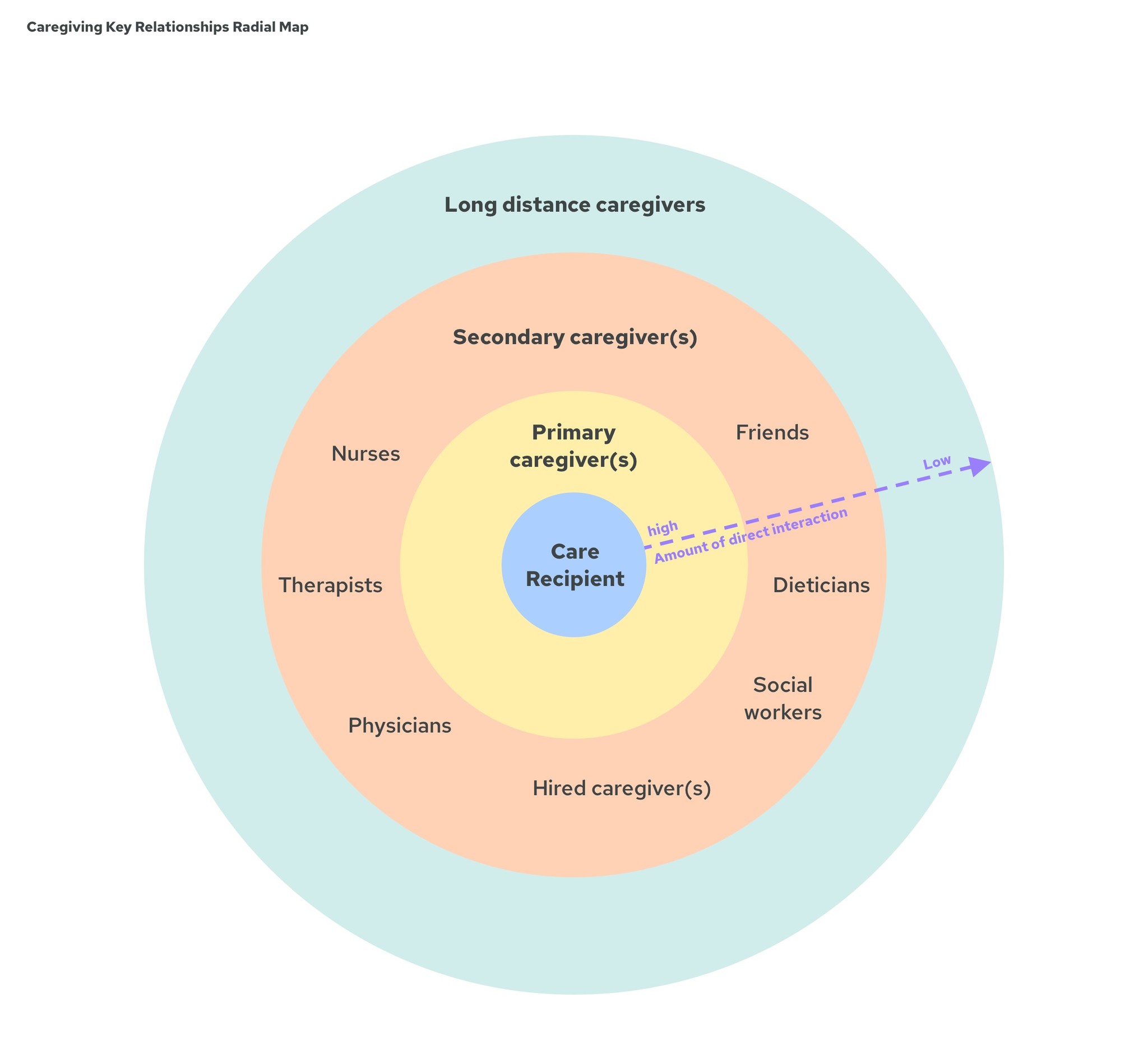
I began by understanding how the system of in-home caregiving works and who is involved.
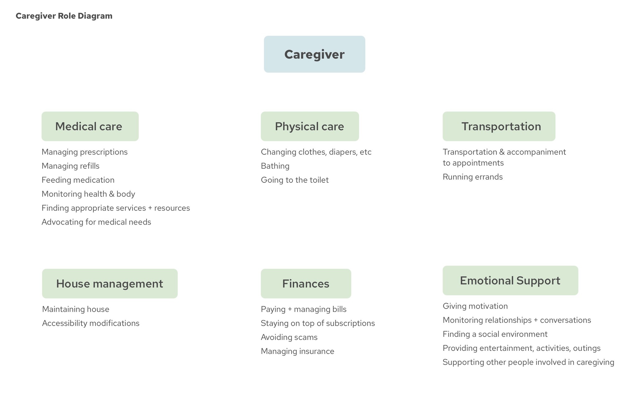
Because different caregivers have different levels of involvement for the care, each type of caregiver has different concerns. I mapped out the roles and relationships to better understand the interactions between each role. I also listed out all the potential duties a caregiver may have - the instructor told us each role exists as a profession, yet it's not uncommon for family caregivers to be juggling all of them at once!
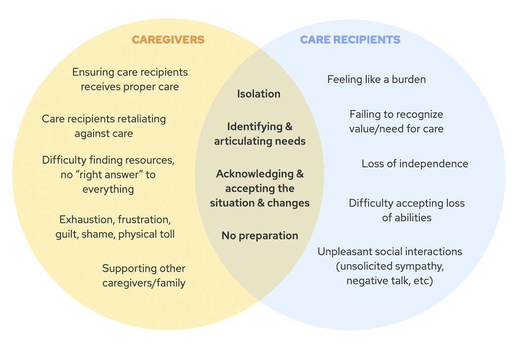
From speaking to caregivers and care recipients, I learned their unique problems as well as their shared problems:
In this overlapping space of shared problems, I created two categories to lay out the specific problems in personal and interpersonal contexts:
Design opportunities
From all the research I gathered, I came up with the following opportunity statements:
How might we help caregivers and care recipients...
... become aware of and acknowledge their current situation?
... recognize and accept changes between the past and the present?
... identify and articulate their feelings and needs?
With these questions in mind, I set forth designing! I structured my prototyping and iterating into three phases, each guided with specific research questions.
What value do people see in these ideas?
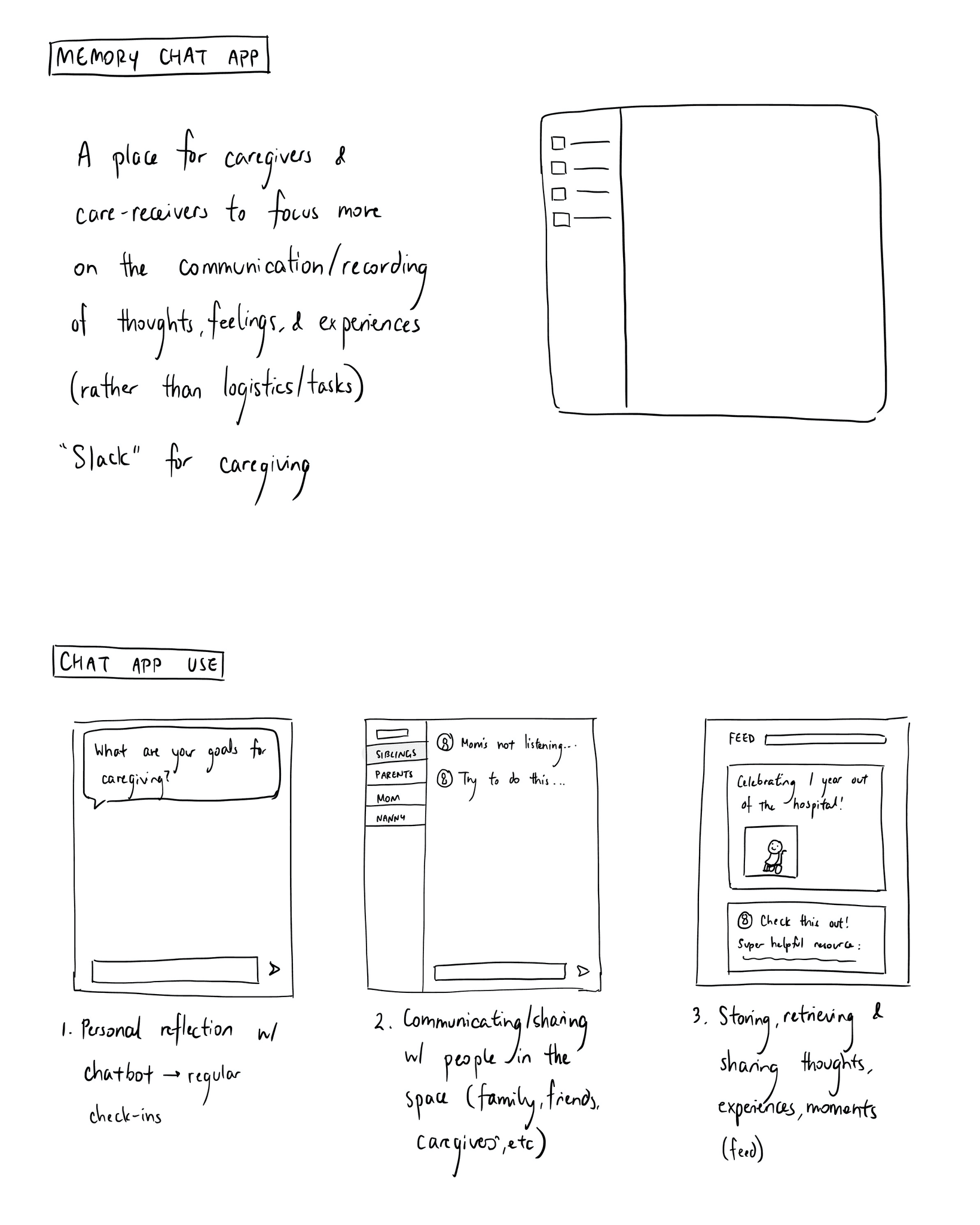
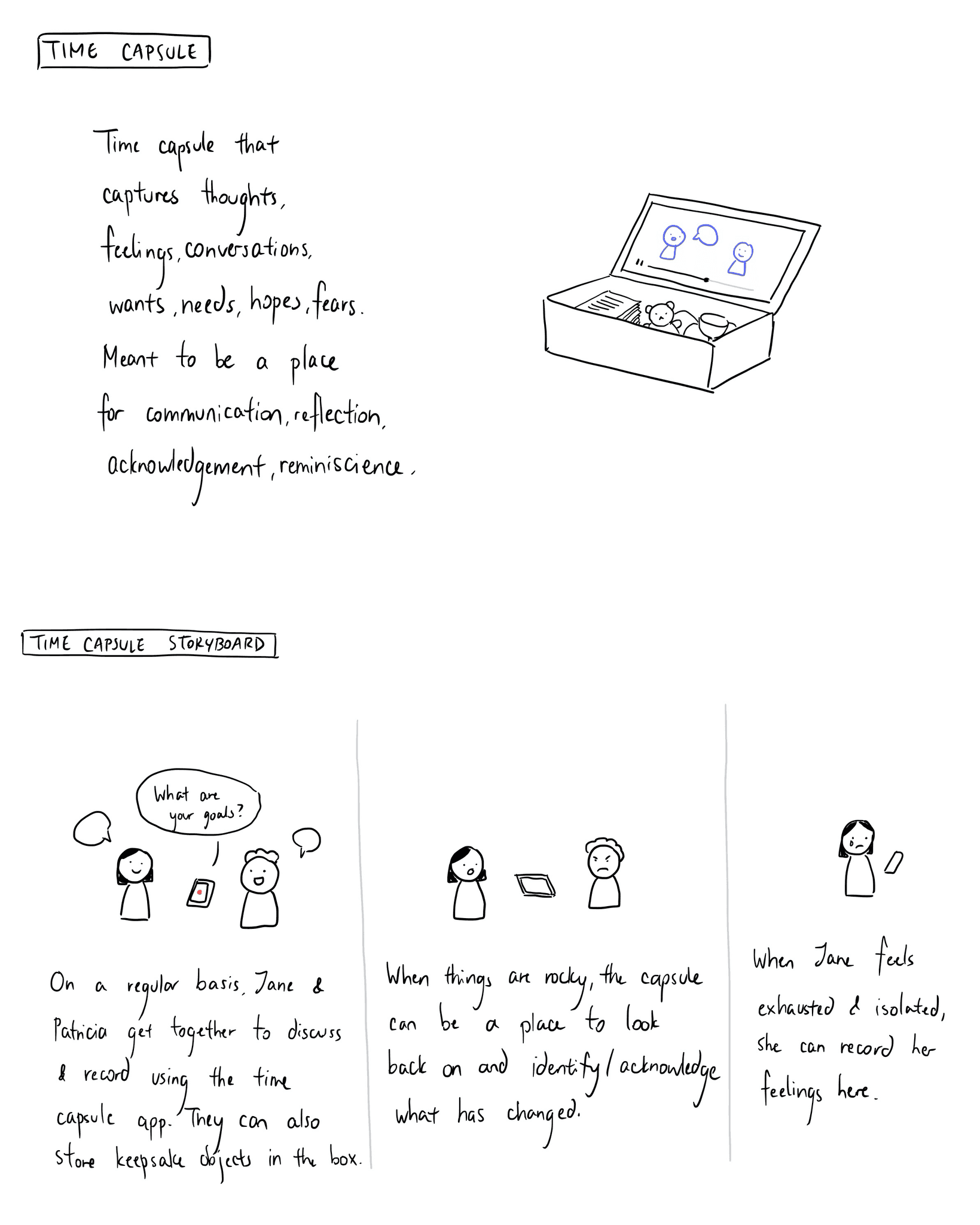
I began by sketching out two ideas: a time capsule and a memory chat app. The time capsule idea was a wonderful suggestion from one of the seniors I volunteered with, who was in a mutual caregiving relationship with her mother.
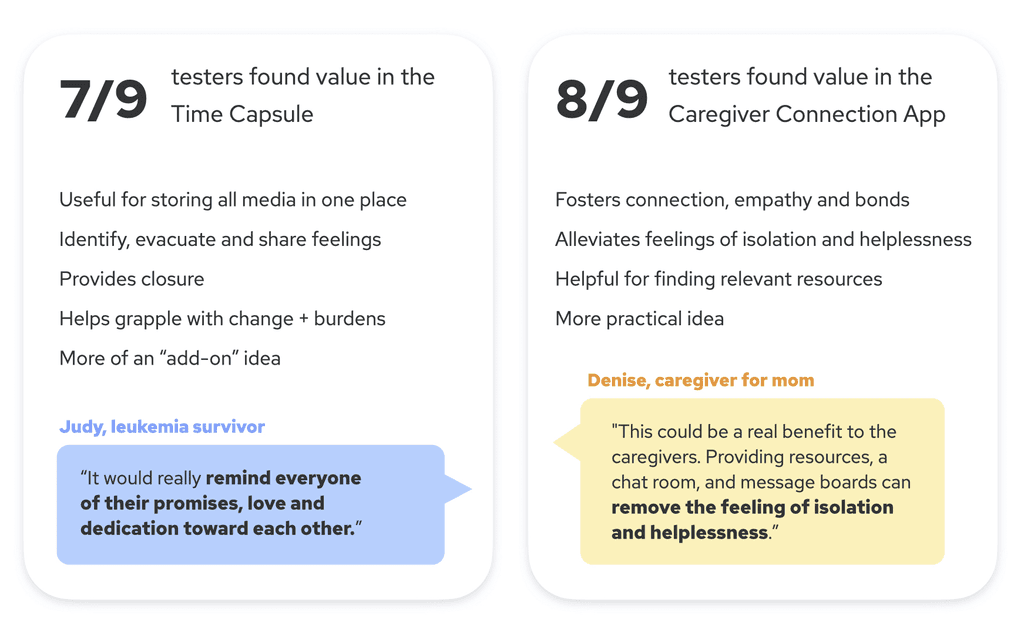
I wanted to know if people would actually find value in these ideas, and why. I tested these concepts with 9 people, and here were the findings:
From this feedback, I decided to move forward with a digital app - a caregiving connection platform with the following 3 main functions:
1) Reflection
Daily check-ins: This was an exercise taught in Caring for the Caregiver called the "Two Minute Morning", that I digitized. The exercise consists of 3 questions, and the goal is to nurture gratitude, awareness, and focus, and has been proven to improve emotional wellbeing.
Affirmations: Many of the caregivers I spoke with experienced guilt, shame and inadequacy with themselves and their abilities. These affirmations would serve as reminders and encouragement for their hard work.
Time capsules: I decided to make this a feature within the Reflection section, as people really valued the positive emotional impact of storing and retrieving memories.
2) Chats
Like a "Slack for caregiving", people can create or join communities to keep connected and updated with each other. Use "topic" chats to make sure the right people get the right information, because different caregivers could have different duties and needs (from the relationship diagrams I created).
3) Social feed
A feed to share moments, thoughts, experiences and resources to everyone in a community.
Is the interface usable? Do people see value after experiencing these flows?
I wanted to ensure the interface and the functions are clear and intuitive to use, and that people still see value after experiencing the flows first hand. I conducted 9 usability tests with caregivers and care recipients, and used my learnings to guide my iterations:
Daily check-ins + affirmations are grounding, can combat guilt and shame.
Combining the daily check-ins and affirmations creates a smoother experience.
Time capsules would help people see and accept the progression of their loved ones and their situation.
People appreciated that different chat topics are focused and lightweight, unlike online forums.
It's convenient to have one place to keep everyone updated, so you don't have to keep repeating yourself.
People value that they can find and connect with others in a similar situation.
People found the social feed redundant and really saw value in the resources aspect of the feed, so I decided to dedicate this section solely to resources.
For the resource onboarding flow, reduce number of choices for interests to create a smoother flow. Also add “who are you caring for?” question, since every relationship dynamic is different (e.g. caring for a parent v.s. a spouse v.s. a sibling)
People want transparency, especially because so many scams target seniors - where are these resources from? Added a hover feature for the articles that provide details of the source.
Do the flows make sense? What's missing?
For phase 3, I user tested with 4 participants and also took the feedback I received in class critique to move toward my final version. Alongside iterating the features and flows, I worked on branding and visual design.
New starting screen - dashboard
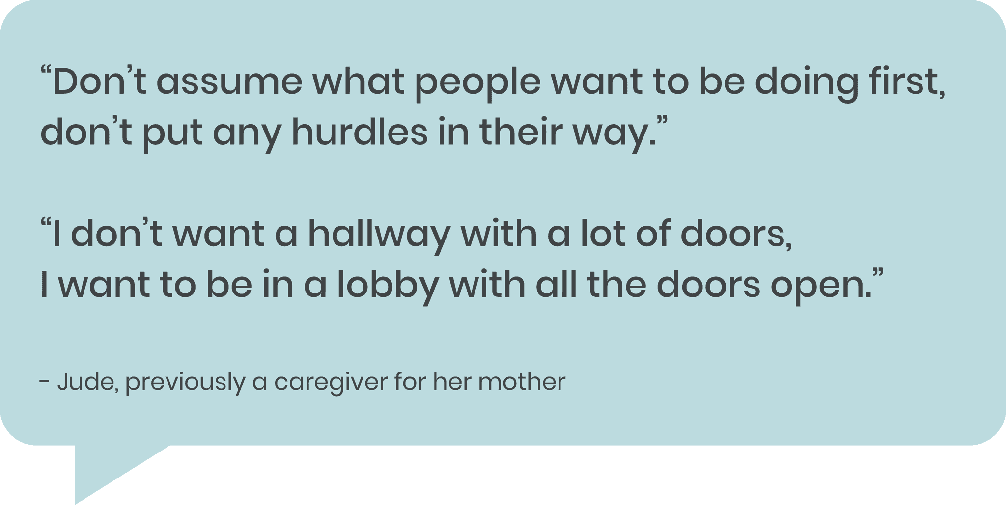
Previously, the starting screen of Kinsight was the Reflection tab. I intended for the user to take a place to step back from all the chaos and see their situation and feelings from a broader perspective. However, I received this valuable feedback from one of my testers:
What did she mean by this? Caregivers, especially those under extreme stress, may not want to reflect as their first action. Stress levels can worsen if they can't get to the information they need the most. Sometimes the number one thing a user needs may be communication (“who’s picking up her prescription?”), or a specific resource ("can my elderly mother travel during a pandemic?"). People want to access what they need as quickly as possible without barriers.
Thus, I created this simple dashboard that users will see when they open the app:
Reflection onboarding demo
To make sure people understand each feature in the Reflection section, I created a hands-on, guided demo for people to discover as they explore the platform for the first time. I wanted to ensure the demo was easy to follow and not tedious. My testers were able to follow the flow easily. For iterations, I made some visual adjustments to increase readability.
Roll a delight
This is a small but delightful feature I implemented toward the end of the project.
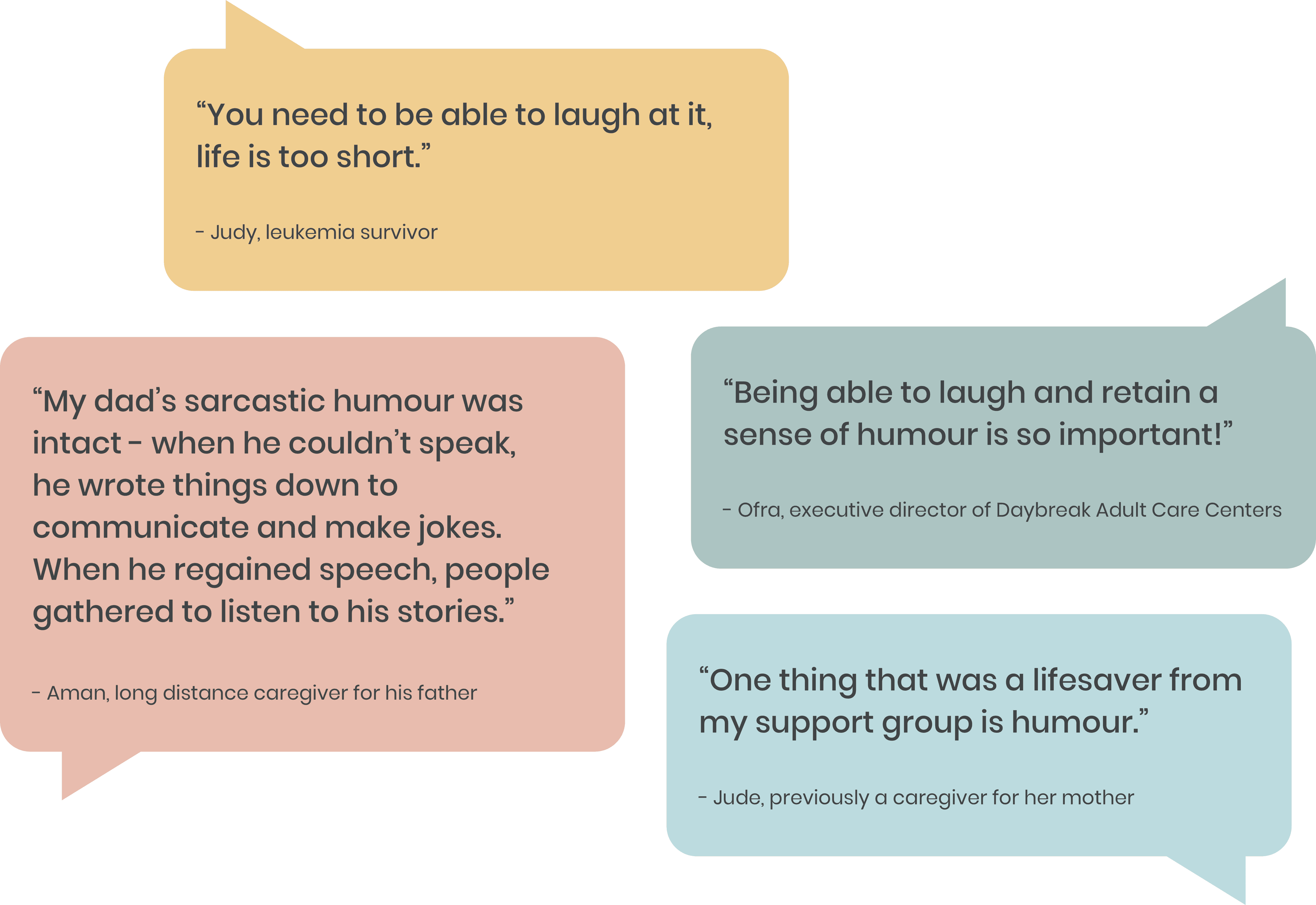
One common theme that came up in my conversations was how valuable humour and lightheartedness is in the journey. No matter how difficult things are, being able to not take things so seriously all the time is crucial to emotional wellbeing.
When a user clicks the Roll a Delight button, they will receive a funny, cute, lighthearted piece of content. I wasn't sure if this would be appropriate, but from testing and feedback, people loved this feature. One participant told me, "I think that's brilliant! I can take a break, catch a breath. I need to escape for a second, stop thinking about [my situation]."
I originally had this feature only in the resources section, but my testers wanted it on every section of the platform! I decided to include it in the side navigation, so it is accessible while unobtrusive.
How do the visuals make people feel? Is the interface usable?
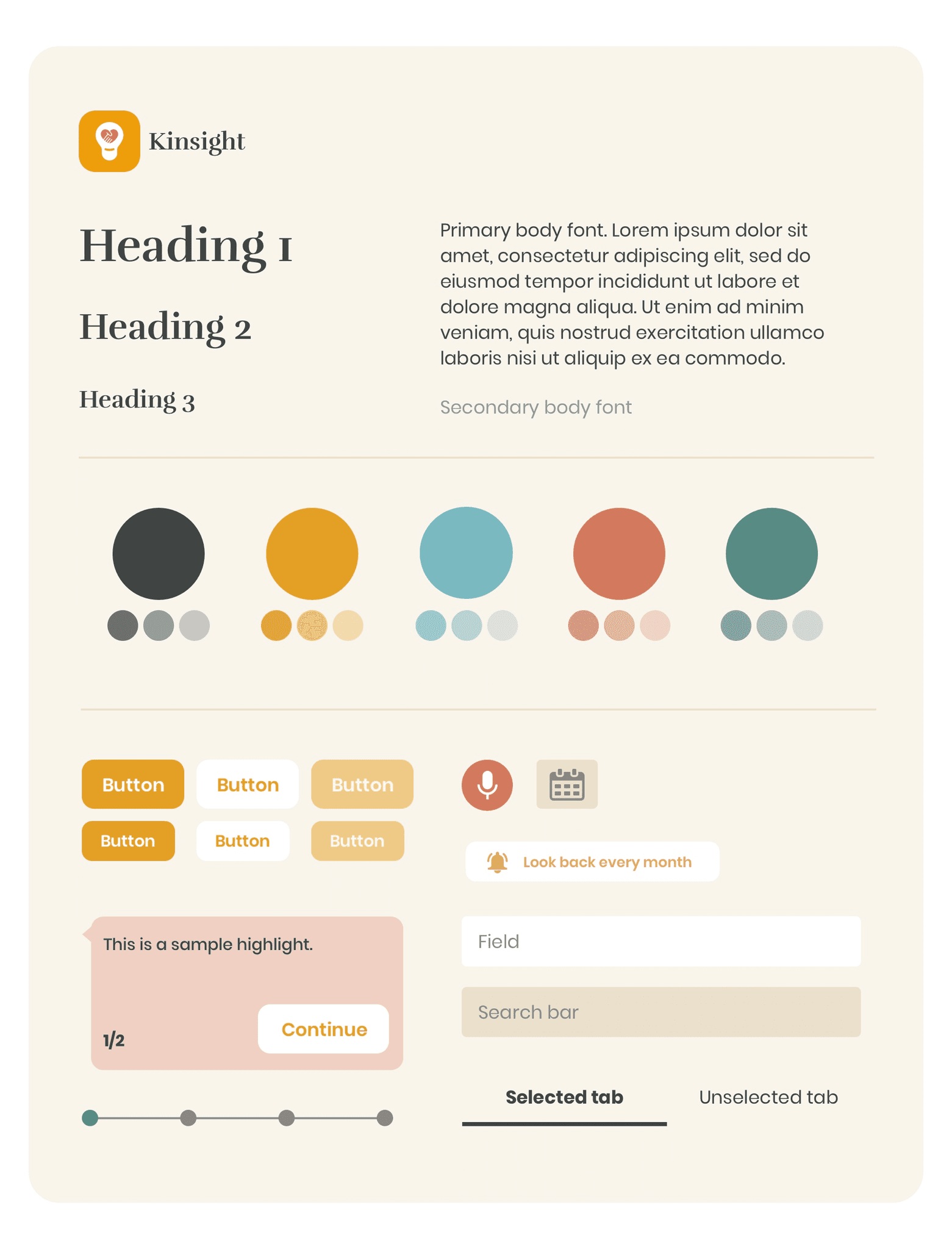
I wanted my product to be warm and comforting for people to use. My early visual designs ranged from being too monochromatic, to looking old-school Wordpress, to seeming like "it was made in the early 2000's" (as a tester put it). Over the course of iterating, I adjusted the colours, contrast, and even increased the font size. My goal was to make the interface more accessible, especially for those with poorer vision, lower tech literacy, and higher stress levels.
For the product name, I decided on "Kinsight", a combination of:
"Kin" - a sense of family, connection and support; and
"Insight" - the reflection, understanding, and awareness my product aims to bring.
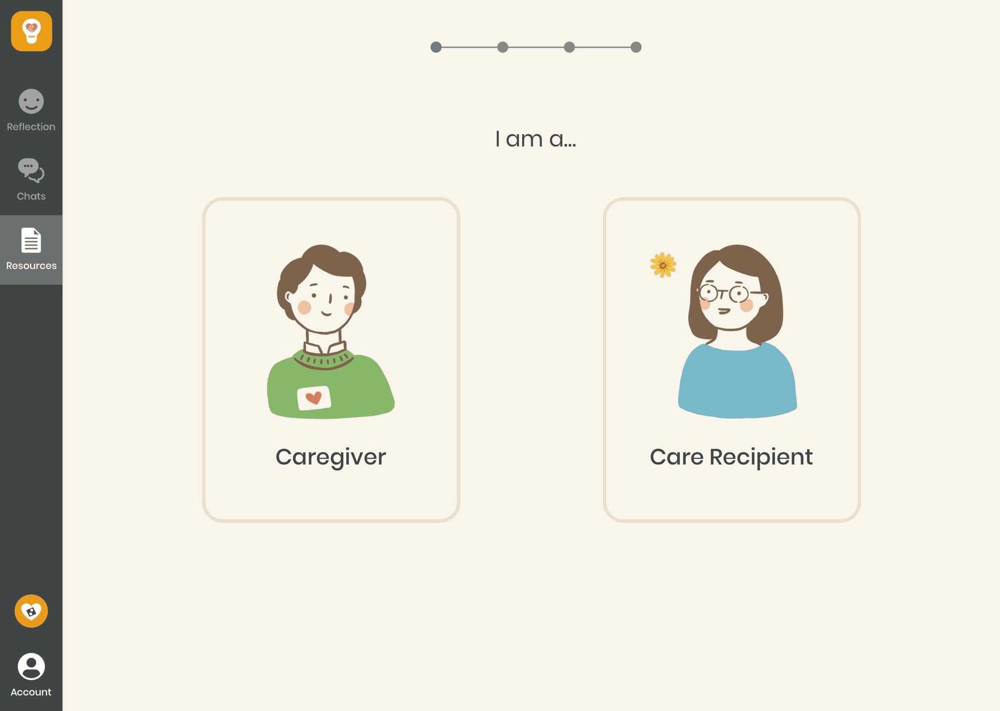
I also created illustrations for certain moments of use, to add delight and warmth for the user.
Reflections
Throughout my time at CCA, this has been the most meaningful project I've worked on. Caregiving is a world that I previously had very little knowledge of, and discovered to be very rich. The stories I've heard and the people I've met (and even befriended) are truly inspiring. Despite a pandemic occuring halfway through this project, I was able to stay in touch with these people and continue working with them. From these virtual conversations, I believe the pandemic is actually further exposing the problems I am trying to address, which gave me more motivation and reason to work on this.
Caregiving is a space I would love to continue working in. If Kinsight were to actually come alive, I would create only one or two features at most, and focus on making them as valuable as possible for my users.
